The vodka is good when you can hardly say its name®

Unpronounceable made talked about

What the company does
Run an organic vodka brand.

What designers did
Developed a disruptive vodka brand, receiving overwhelming customer praise and igniting a broad discussion about design within the alcohol sector.

Verbal Identity

Naming

Full brand name:
The vodka is good when you can hardly say its name®

Abbreviation:
Tvigwychsin®

Brand Anthem

When you judge life with a glance of an old theatre critic,
Wishing once again to face it with young poet's roaring mind,
When each shot tastes like a battle cry of Polish cavalry,
And you look at each glass as the modernist's last masterpiece,

When your friends and enemies join to play your favourite song,
And you approach people with a cartoon's hero charming grace,
When you wake up naked and confused, yet filled with hope and joy,
And you call your morning lover by the name of Tvigwychsin,

The vodka is good.

Tagline
Supportive Copy

Slogans (basic communication):

When you say you're bilingual, and your date thinks it's kinky,
the vodka is good.

When you're composing, but can't compose yourself,
the vodka is good.

Slogans (merchandise):
Tote bag:

When you’ve dedicated your life to your old bag,
the vodka is good.

Drink coasters:
When you’ve reached the bottom,
the vodka is good.

Box:
When that box happens to be in your house, and you have fifteen missed calls from your boss,
the vodka is good.

T-shirt:
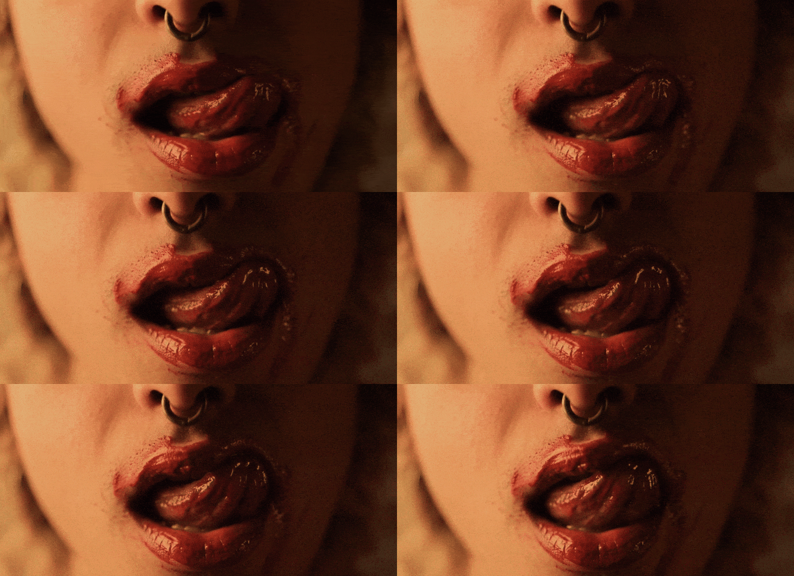
When you’re reading this through lipstick marks, tortilla stains and bullet holes,
the vodka is good.

Social media:
When you're being chased by a Guatemalan ninja chicken, and you've run out of Tabasco,
the vodka is good.

What's interesting

The valid name of the brand is 'The vodka is g**d when you can hardly say its name®.’ 'Tvigwychsin' is the abbreviation.

What's interesting

Due to legal restrictions regarding the advertising of alcohol, we were unable to openly communicate that the vodka is good without the need for censorship.*
*This sentence does not constitute advertising within the meaning of the Act on Upbringing in Sobriety and Counteracting Alcoholism.

What's interesting

As a semi-no-name brand, the design seemingly breaks most marketing rules, and some would argue that releasing such a product is professional suicide.

What's interesting

Weeks before the brand's premiere, a famous chef leaked photos of the vodka on his Instagram. This led to hundreds of inquiries, forcing founders to accelerate the product launch.

What's interesting

The label paper allows to write a dedication. To demonstrate, the designer drew a dinosaur and a penis. The client loved it.

Designer's insight

"This was the toughest project from a purely craftsmanship point of view. And the result of a dyslexic brain, so I can't even logically explain the process behind it all. I just knew it had to be the most bonkers concept, turning all the rules of marketing on their head, but still working. So the bar was set bloody high. It wasn't some artistic nursery where nothing makes sense. It had to give the impression of making no sense, but be built on an absolutely thought-out and meticulously refined foundation."

— Mariusz Ruciński,
Brand Identity Architect + Verbal Designer

Some people say things you'd never believe

We asked for a brand that would blow our minds and stir up the vodka market. We got way more than we expected. People were hyped months before we even officially released and advertised the product.

Paweł Czerniakowski & Aldona Karczmarczyk

Co-founders—The Vodka Is G**d When You Can Hardly Say Its Name

Summary

What is the company's profile

A producer of organic vodka, aiming to disrupt the old-fashioned alcohol sector.

What is the extent of tasks

A        Brand Personality (Market Landscape Analysis, Current Brand Analysis, Industry Analysis, Corporate Culture Analysis, Company Analysis, Product/Service Analysis, The Big Idea, Brand Positioning, Brand Strategy, Brand Story, Brand Character).

B        Brand Language (Domain Naming, Slogans/Claims, Key Messaging, Descriptor, Tagline, Brand Tone & Voice, Brand, Brand Statement, Brand Storytelling, Brand Anthem, Brand Sales Writing).

C        Brand Appearance (Brand Visual Identity, Visual Needs Analysis, Brand's Visual Expression Concept, Information Architecture, Functional Design Systems, Brand Art Direction, Logomark, Logotype, Iconography, Brand Visual Architecture, Brand Color Palette, Brand Typography, Brand Graphics & Patterns, Imagery & Photography, Branding Guidelines, Grids, Brand Collateral, Packaging Design, Editorial, Stationary, Web & Digital Design, UX/UI Design).

What are the objectives
A        To create a disruptive, modern vodka brand contrasting with a predominantly conservative market.

B        To target stakeholders who value modern design and seek alternative products.

C        To develop a distinctive brand language that initiates interactions within a social context.

How we achieved the objectives

A        The first step was positioning and anchoring, in this case, it's a drunkard's mumbling. It originates from a triangle of dependencies: if it's vodka, it must be Polish; if it's Polish, it must sound unintelligible; if it sounds unintelligible, it must be because of vodka. The cycle then repeats.

B        The third step was verbal design. The brand language is a blend of high-toned and pedestrian absurdity, humorously combining intellectuality with a touch of intoxication. Thus, there are two names for the brand: the full, 'intellectual', name – 'The vodka is g**d when you can hardly say its name®' – and the 'intoxicated' abbreviation – 'Tvigwychsin'. The brand 'poem' functions as a positioning tool, immersing the audience in the world of the brand.

C        The third step was verbal design. The brand language is a blend of high-toned and pedestrian absurdity, humorously combining intellectuality with a touch of intoxication. Thus, there are two names for the brand: the full, 'intellectual', name – 'The vodka is g**d when you can hardly say its name®' – and the 'intoxicated' abbreviation – 'Tvigwychsin'. The brand 'poem' functions as a positioning tool, immersing the audience in the world of the brand.

D        The fourth step involved recognizing and addressing the fundamental challenge of implementing a system that was intentionally designed to confuse the customer. The brand lacks a clear name, and pronouncing it is both confusing and socially awkward, making ordering it more difficult. The goal was to keep the disruptive design but balance it with visual aids.

E        The fifth step involves adapting the strategic and verbal concept to the visual design and addressing the challenges mentioned above. The laser-green colour, along with placing the label at an angle, serves as the first visual aid, making the bottle stand out and easier to spot and describe to the clerk or bartender. The second visual aid involves placing the bottle on the shelf with the label facing backward, revealing the brand name that can be read through the glass.

F        The sixth step involves educating sales representatives on how to pronounce the brand name and provide support to the buyer.

Authors

Brand Identity Concept + Positioning
Mariusz Ruciński

Verbal Identity + Copywriting
Mariusz Ruciński

Visual Identity + Art Direction
Maciej Bączkowski

Operational Management
Grzegorz Derlukiewicz

The following case study is published under a license from the copyright owners and reflects the authorship of our team in cooperation with another studio.

Results

2023
KTR
Bronze—Communication / Art Direction

We use cookies to analyze traffic and gain a better understanding of our audience. Learn more
Strategy
/
Verbal Design
/
Packaging
/
Visual Design
/
Naming
/